The
Kernel Density map would be the best map for predicting future homicides
because it does more than just consider total households and total homicides or
even crime rate. It considers the density of homicides with relation to area
and the number of homicides and the output results in smaller, more focused
clusters.
Sunday, July 26, 2020
Crime Analysis
Module 4 explored using hotspot mapping for crime analysis. We learned how to aggregate crime events to determine crime rates and practiced the use of local and global spatial clustering methods. We also examined spatial patterns in crime rates and socio-economic characteristics. Three hotpot mapping techniques we used were grid based thematic, kernel density, and Local Moran's I. It was determined that the best hotspot mapping technique for police departments to use for predictive policing is kernel density.
Saturday, July 18, 2020
Visibility Analysis
For Module 3, we had to take 4 training courses in Esri. The
training courses were 3D Visualization using ArcGIS Pro, Performing Line of
Sight Analysis, Performing Viewshed Analysis in ArcGIS Pro, and Building Models
for GIS Analysis Using ArcGIS. All four of the courses trained on how to use
geoprocessing tools to manipulate ArcGIS to provide the best output for data
analysis. In 3D Visualization, we linked 3D scenes and 2D maps to enable side
by side visualization. We also extruded 2D features based on attributes,
applied photorealistic symbology, light, and shadow, and shared a 3D scene in a
map layout. In the Performing Line of Sight Analysis, we learned the workflow
for performing visibility analysis. The exercise had us determine the line of
sight for a parade path from a building. The workflow for this was determine observers
(top of building) and targets (parade path), construct sight lines, and
determine line of sight. The geoprocessing tools used for this were Construct
Sight Lines (3D Analyst Tool), Line of Sight (3D Analyst Tool) Tool, Add Z
Information (3D Analyst Tool), and Select by Attributes. For Performing
Viewshed Analysis in ArcGIS Pro, we learned how to use the Viewshed Tool to
model visibility from vantage points. The geoprocessing tool considers the
height of the individual and surrounding objects, and reflects visible light (you can adjust
refractivity coefficient). The symbology of the tool results indicates which areas
are visible and which are not. For the Building Models for GIS Anallysis Using
ArcGIS, we learned how to use Model Builder to create geoprocessing models that
form an analysis workflow that can be executed with one click. It teaches that
the three elements used to create these models are variables, tools, and
connectors. Each have different colors and shapes assigned in the model
builder. These are create to build simple to complex workflows that need to be
tailored to a specific company or job and can be shared easily.
Sunday, July 12, 2020
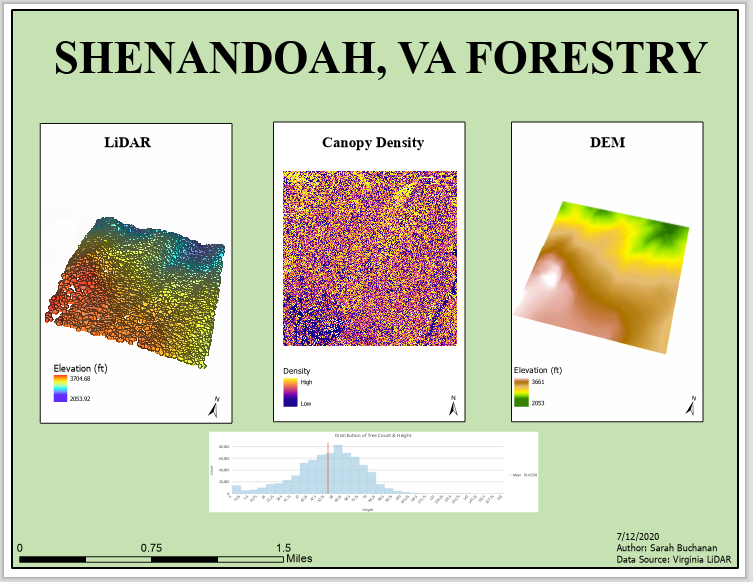
Forestry & LiDAR
For this week's lab, we learned how to create a DEM and DSM from LiDAR data. The Shenandoah, VA forest area was the region focused on for this assignment. After the DEM and DSM was created, a variety of geoprocessing tools were used to calculate the canopy density and tree height. This was achieved by using the LAS Dataset to Raster for ground points and non-ground points from the LiDAR data to create a DEM and DSM. Then, the minus tool input the DSM followed by the DEM to create the tree height raster. The biomass (canopy) density was constructed through multiple geoprocessing tools. The LAS to Multipoint tool was initiated twice to create a ground and vegetation file. Then these files were created to rasters by using the point to raster tool. Both rasters were input the IS NULL tool to assign the number 1 to every attribute that was not null. The Con Tool was used to identify all zeros as true values and all ones to come from the original raster; this was completed for both ground and vegetation rasters. The Plus Tool combined the ground and vegetation counts and the Float Tool transformed results from integer to float. Finally, the Divide tool set the vegetation count to the float results to return the canopy density.
Wednesday, July 8, 2020
Least Cost Path Corridor Analysis
For the least cost path corridor analysis map, I had to locate potential black bear movement between protected areas of the Coronado National Forest. I used the calculate raster tool with the
expression 10-weighted overlay raster. I converted the Coronado polygons to
rasters. Then, I used the cost distance tool twice to generate two cost surface
layers with the Coronado rasters as the inputs, respectively. I then used the
corridor tool twice with each Coronado cost distance layers as the input. The
corridors that were generated covered the map but I narrowed it down to two
layers. Essentially, the first one covered both Coronado polygons on the map
and I had a second layer highlight just outside of it to show a variance.
Suitability Analysis
For the suitability analysis, I had to produce a map showing an equally weighted overlay and an unequally weighted overlay map. I worked with five layers: river, roads, elevation, soils and landcover. I reclassified the elevation. soils, landcover layers and assigned suitability ratings. I also had to convert the soil from polygon to raster. For the rivers and roads layers, I used the euclidian distance tool and assigned suitability ratings to the ranges. I used the weighted overlay tool to combine all four of the raster layers and produced two maps: 20% for the equal on each landcover, elevation, rivers, and roads. For the unequal, 40% land cover, 20% soil, 20% elevation, 10% roads, and 10% rivers.
Subscribe to:
Posts (Atom)