Friday, October 16, 2020

Scale Effect & Spatial Data Aggregation

 This week we learned about scale effect and spatial data aggregation. The effect scale has on vector data, how cell resolution affects raster data, and how measuring compactness of congressional districts can identify gerrymandering. Spatial data aggregation is often used in GIS and data analysis and thus we have to contend with the implication of the modifiable areal unit problem (MAUP), where loss of data can occur. The MAUP has two main issues that concern analysts: the scale effect and the zonation effect.

As the scale decreases, the geometric properties for the hydrographic features decreases as well. Vector data is more detailed the larger the scale is and will include more vertices and/or smaller features.

The DEM for a small coastal watershed in California was reclassified multiple times at different resolutions. As the resolution increases, the level of detail in the DEM decreases. The average slope of the DEM also decreases as the resolution increases.

The compactness of an area is one of the guidelines for drawing congressional districts to minimize oddly shaped areas. I calculated the Polsby-Popper score to determine the compactness of the congressional districts. The closer to 1 correlates with being more compact as the closer to 0 correlates with being less compact. Below is a screenshot of the worst offender, Congressional District 12 in North Carolina, with a PP score of 0.29!


Wednesday, October 7, 2020

Surface Interpolation

 For this week's module, we learned about different methods to use for surface interpolation. The three different methods explored were Thiessen Polygons, IDW, and Spline (Regularized/Tension). Thiessen interpolation method assigns interpolated value equal to the value found at the nearest sample location. Some advantages of the Thiessen interpolation method are that the polygons are only created once and it’s the easiest method to conceptualize and apply. Some disadvantages are that topography is not considered and boundaries are often oddly shaped (not smooth and continuous like spline). IDW interpolation determines values by using a linear-weighted set of sample points. The weight assigned is a function of the distance from the sample point from output cell location. The further away, the less weight that is assigned to the sample point. The spline interpolation estimates values using a mathematical function that minimizes overall surface curvature and shows smooth surfaces that pass through each sample point.

We used the various surface interpolation methods to explore the water quality conditions in Tampa Bay. The dataset of sample points were gathered and the water quality was determined by measuring the Biochemical Oxygen Demand (BOD) of each sample. After analyzing all of the methods, I chose the Spline with Tension Interpolation method to develop a good description of the BOD concentrations in Tampa Bay. Spline interpolation surfaces are smooth and easier to read than IDW. It appears that the sample points were taken in a uniform distance and amount so I feel better about any distortions skewing the surfaces. This is highlighted between the Spline Regular and the Spline with Tension. Once the two data points that were too close together were moved, it depicted the overall data better.


Wednesday, September 30, 2020

TINs & DEMs

 TINs use vector (point) data while DEMs use raster (grid) data. The most noticeable differences between the Tin and DEM is some of the contour lines on the TIN produce sharp edges that do not close while the contour lines on the DEM are smooth and continuous. The areas where the contour lines are closest together (steepest) show the smallest amount of differences between the TIN and DEM. I infer that the DEM contour lines are more accurate because they have the advantage of containing more reference data. 


Sunday, September 27, 2020

Assessment: Road Networks

For this week's module, we learned how to determine the quality of road networks by employing methodology similar to a study conducted by Haklay (2010). The completeness of two road networks, Street Centerlines and TIGER, were determined by measuring the total lengths of road in Jackson County, Oregon. We were provided a polygon grid of the county. By using the summarize within tool, I was able to calculate the total kilometers of road for each road network shapefile in each grid.The Tiger shapefile contains 11382.7 Km of road segments and the Street Centerlines shapefile contains 10873.3 Km of road segments. The Tiger road network is the most complete.
  

I also created a join for the two road shapefiles by joining the Gridcode fields. I did a quality check and selected by attribute for each length field to see if any Grids had a value of zero and discovered two. I changed the field value to Null. I added a field and calculated the field with the statement:

!Grid_SummarizeWithin_Street.SUM_Length_KILOMETERS!>!Grid_SummarizeWithin_Tiger.SUM_Length_KILOMETERS! 

This returned a value of 1 if it was true and a value of 0 if it was false. The value of 1 indicated the Street Centerline was more complete and the value of 0 indicated the Tiger network was more complete. The Street Centerline network was more complete than the Tiger network in 134 out of 297 grids. The Tiger network was more complete than the Street Centerline in 162 out of 297 grids. . One of the grids did not contain any road segments and one only contained 5 km of TIGER road so both were excluded from the map. 


Tuesday, September 8, 2020

Standards

 This week we learned how to determine the quality of road network data. This was accomplished by determining the horizontal accuracy of the ABQ Streets (shapefile of road centerlines from Albuquerque, NM and StreetMap USA (shapefile of street centerlines from StreetMap USA) compared to reference points of true intersection locations. Inside the study area, I created two new feature classes of 20 test points for the ABQ Street shapefile and StreetMap USA shapefile. The criteria followed was using a good intersection, meeting sampling rules (minimum of 20% in each quadrant and >10% diameter apart), and matching locations in the two datasets.  After I completed the test points, I created a new feature class named reference points and created 20 points depicting the true intersection of my test points. To determine the accuracy statistics, I added XY coordinates to the feature classes to later add to the NSSDA Horizontal Accuracy worksheet.

City (ABQ) Accuracy Statement:  Using the National Standard for Spatial Data Accuracy, the data tested 14.47 feet horizontal accuracy at 95% confidence level.

StreetMap USA Accuracy Statement:  Using the National Standard for Spatial Data Accuracy, the data tested 160.00 feet horizontal accuracy at 95% confidence level.


Wednesday, September 2, 2020

Fundamentals

Many GIS organizations define precision and accuracy limits for their geospatial data and perform reviews of this data to ensure that standards are upheld. Accuracy is defined as "the closeness of agreement between a test result and the accepted reference value". Precision is defined as "the closeness of agreement between independent test results obtained under stipulated conditions". For this module, we determined precision and accuracy metrics based off provided data. The data provided was GPS waypoints mapped using a hand-held GPS device, a Garmn GPSMAP 76 unit.

 The horizontal accuracy of 3.24 meters was determined by measuring the distance between the reference point and the average waypoint location. The horizontal precision is 4.5 meters. There is a significant difference of 1.26 meters. The vertical accuracy (average location elevation-reference location elevation) is 5.92 meters. The vertical precision is 5.9 meters. The difference between the vertical accuracy and vertical precision is 0.02 meters. There is not a significant difference between vertical accuracy and vertical precision.


Thursday, August 6, 2020

Damage Assessment

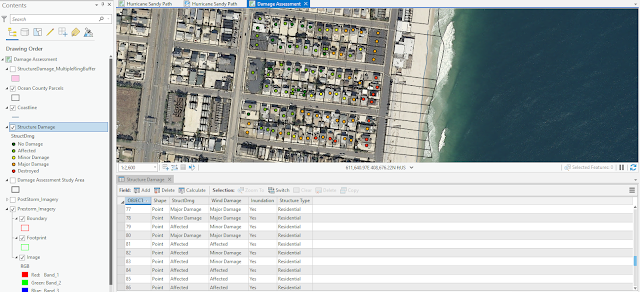
For this week's module, we finished our damage assessment on Hurricane Sandy. We were tasked with categorizing and counting the amount of structure damage caused to buildings in a study area in Ocean County, NJ. This was done by analyzing a pre-storm aerial and a post-storm aerial to determine the amount of damage that occurred in accordance to distance from the shoreline. It was simple to determine homes with major damage or destroyed but it was much trickier to discern between minor damage, affected, and no damage without having the benefit of street view images. A county parcel was used to ensure a structure was digitized in every parcel. After the attributes for the storm damage were added, I changed the symbology to unique values to assign a continuous color ramp to the symbols with labels. To determine the type and number of structural damage caused every 100 meters from the storm, I used the Multi Ring Buffer geoprocessing tool. Fortunately, every building fit entirely inside a buffer ring. This part of the analysis showed that the amount of damage decreased every 100 meters.